Tiqmo is a fintech app based in Saudi Arabia that allows users to easily send and receive money. It allows users to make payments, pay bills, make local & international transfers, and more.
Role
Product Designer
Team
3 Engineers
1 Product Manager
Year
2024

The Problem
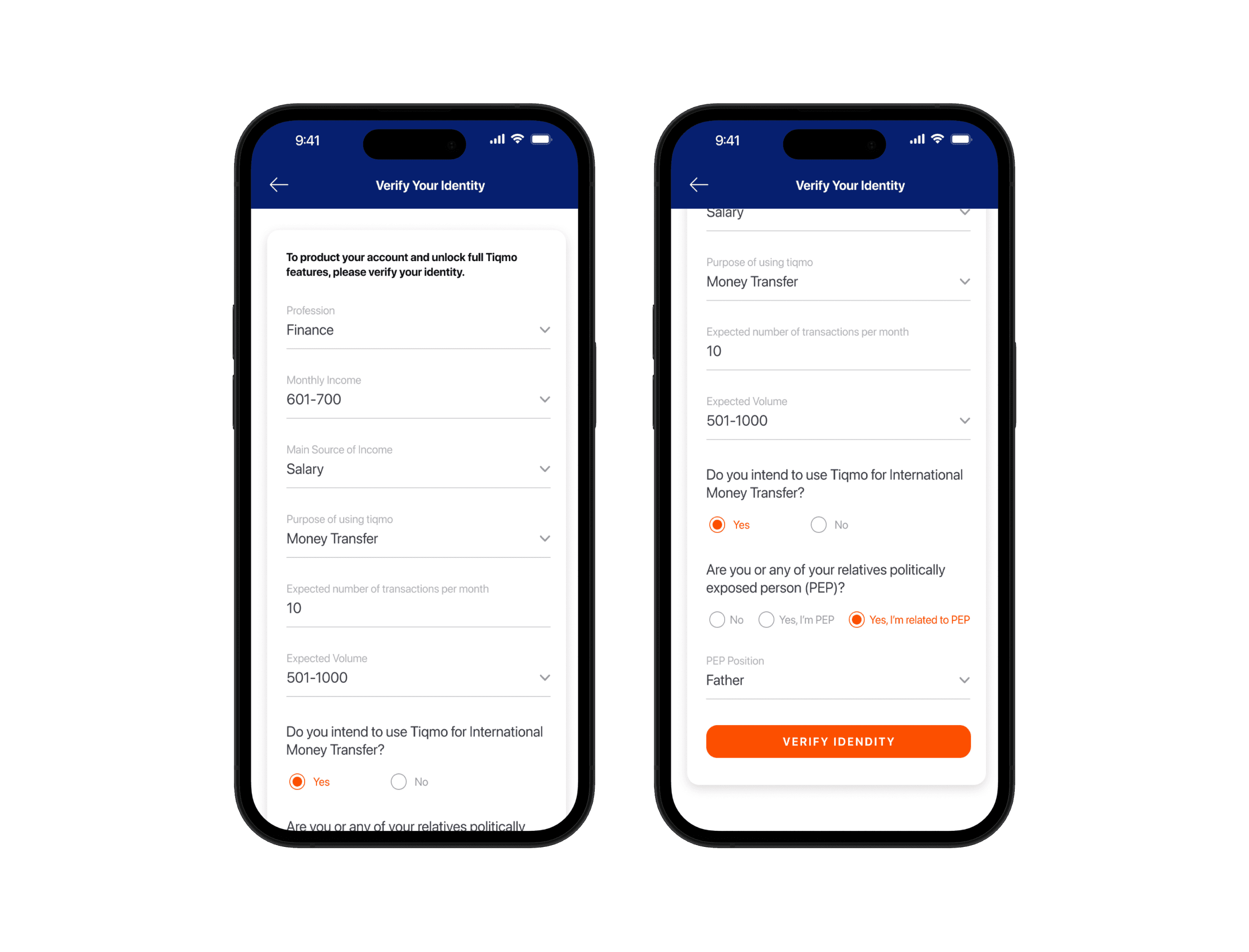
The original Tiqmo onboarding process required users to fill out a lengthy KYC (Know Your Customer) form presented as a single, overwhelming page. This caused a significant number of user drop-offs at this stage (55% approx.) which needed to be addressed.
The Research
We needed to understand the main pain points from the users' perspective about this specific screen, focusing on identifying what caused frustration and led to drop-offs during the onboarding process.
Customer Feedback Outreach
We picked a sample of 15 users who dropped off at this stage and reached out to them individually with the help of the customer support team. The users were asked to give feedback about the onboarding experience, their frustration with this specific screen, and how they would change/improve it.
Research Findings:
#1
Users felt overwhelmed by the extensive KYC form being presented all at once.
#2
60% of users mentioned that the long form made them feel like the rest of the onboarding experience would be complicated.
#3
Users reported that the scrollable form gave them the impression there were more questions than there were, leading them to believe it would take more time to complete. As a result, they closed the app to return later when they had more time.
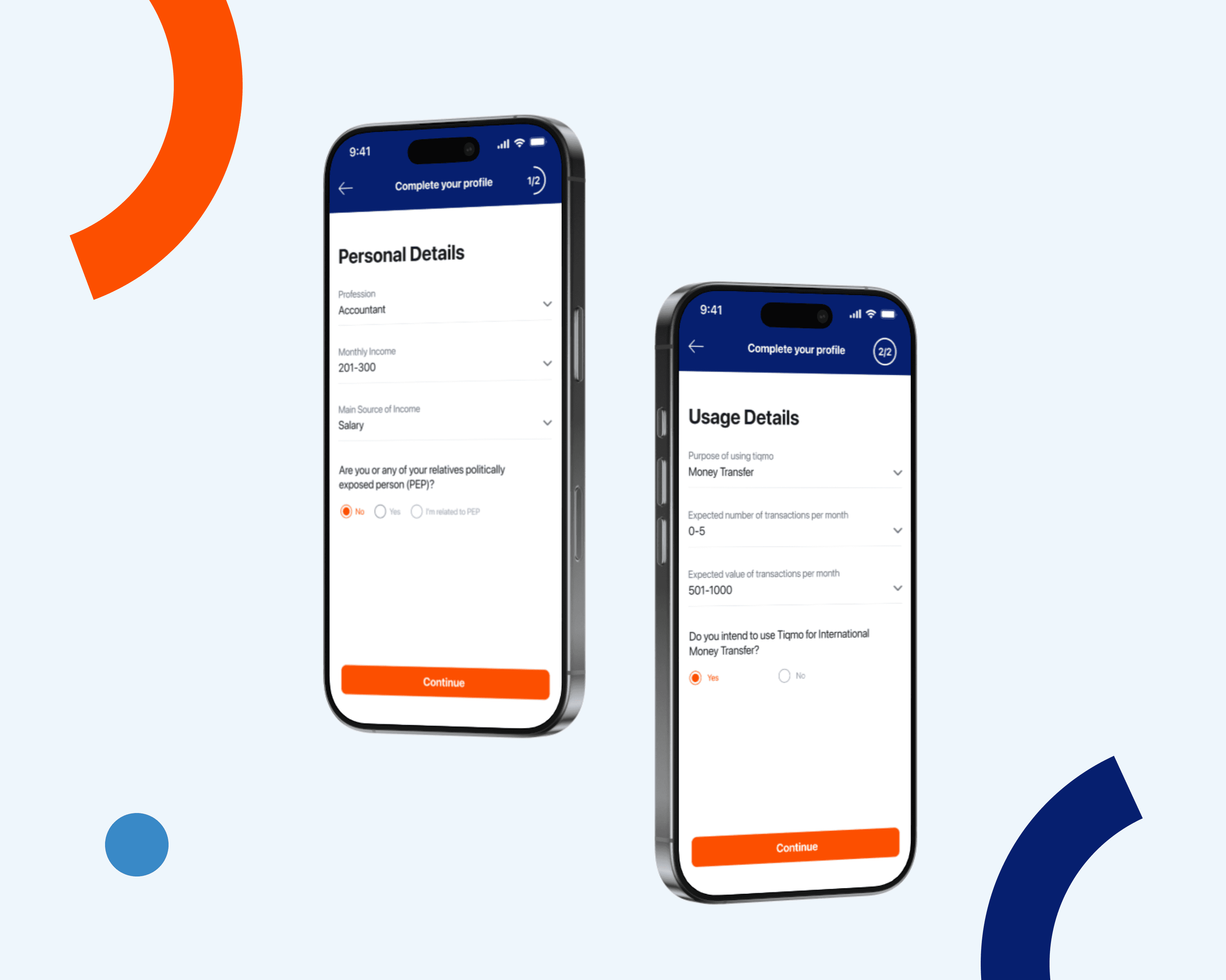
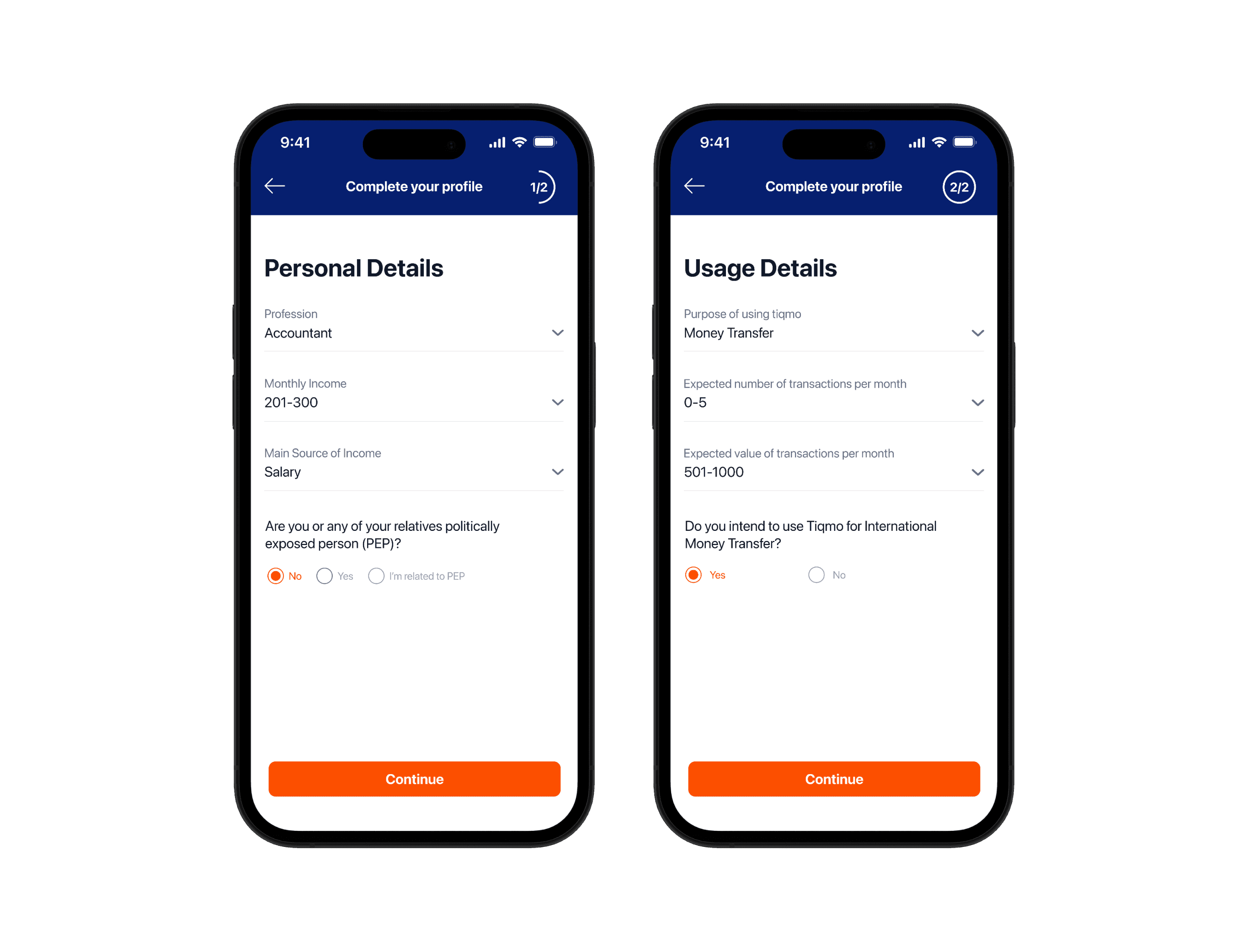
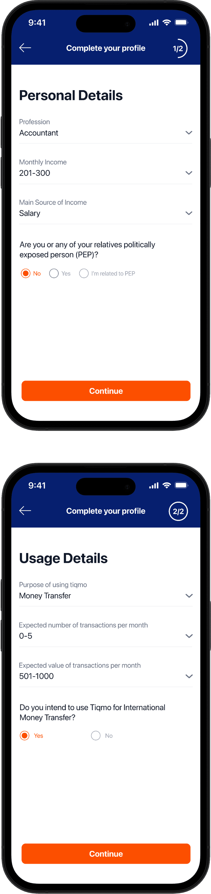
The Solution
From the research, we concluded that splitting the KYC form into a two-step journey would ease the users into it and make it less overwhelming, we also added a step counter to inform the users of the current state and set their expectations about how long the process is.
The Result
After pushing the update, we contacted the affected users who were previously contacted for the research, along with monitoring the overall app performance, and here are the findings:
Users felt overwhelmed by the extensive KYC form being presented all at once.
Users mentioned that the long form made them feel like the rest of the onboarding experience would be complicated.
Users reported that the scrollable form gave them the impression there were more questions than there actually were, leading them to believe it would take more time to complete. As a result, they closed the app to return later when they had more time.