QNB Al Ahli is one of the leading financial institutions in Egypt. It has been in the industry since 1978 and is ranked the second-largest private bank in Egypt.
However, their mobile banking app is not user-friendly and a bit outdated so I decided to redesign it.
Role
UX Designer, UI Designer, UX Researcher
Team
Solo (Personal Project)
Year
2021


The Problem
The application does not have a proper onboarding experience, lacks a lot of navigation and discoverability features, and the UI and visuals are outdated. These problems are affecting the experience of the app and make it hard for the user to achieve their goal.
The Research
The main goal of this research was to understand what the users goals are and how they go about achieving them with the current app. In addition, I wanted to know what do users want in a mobile banking app and what do they want to change in the experience of the app.
In-person Interviews
I had a casual meeting with 5 of my friends/family/acquaintances with ages ranging between 21-45 to have conversations about the challenges they face using the app and their behavior patterns of how they approach it.
Observation session
I asked the interviewees to perform some tasks on the current app (for example: check their balance, navigate the transactions page, etc.), observed how they interacted with the app, and took notes.
Research Findings:
Users don't want to spend much time (if any) on mobile banking apps, they just want to get the information they need and leave. In the current state, the user is required to go through multiple clicks to reach basic details such as the current balance (4 out of 5 users mentioned that this is their main goal), causing frustration to the users.
The outdated UI is one of the problems our users said is discouraging them from using the app. Even though the app does what it is designed to do, users want more than just functionality. The transitions between pages are not satisfying and the whole experience is not aesthetically pleasing.
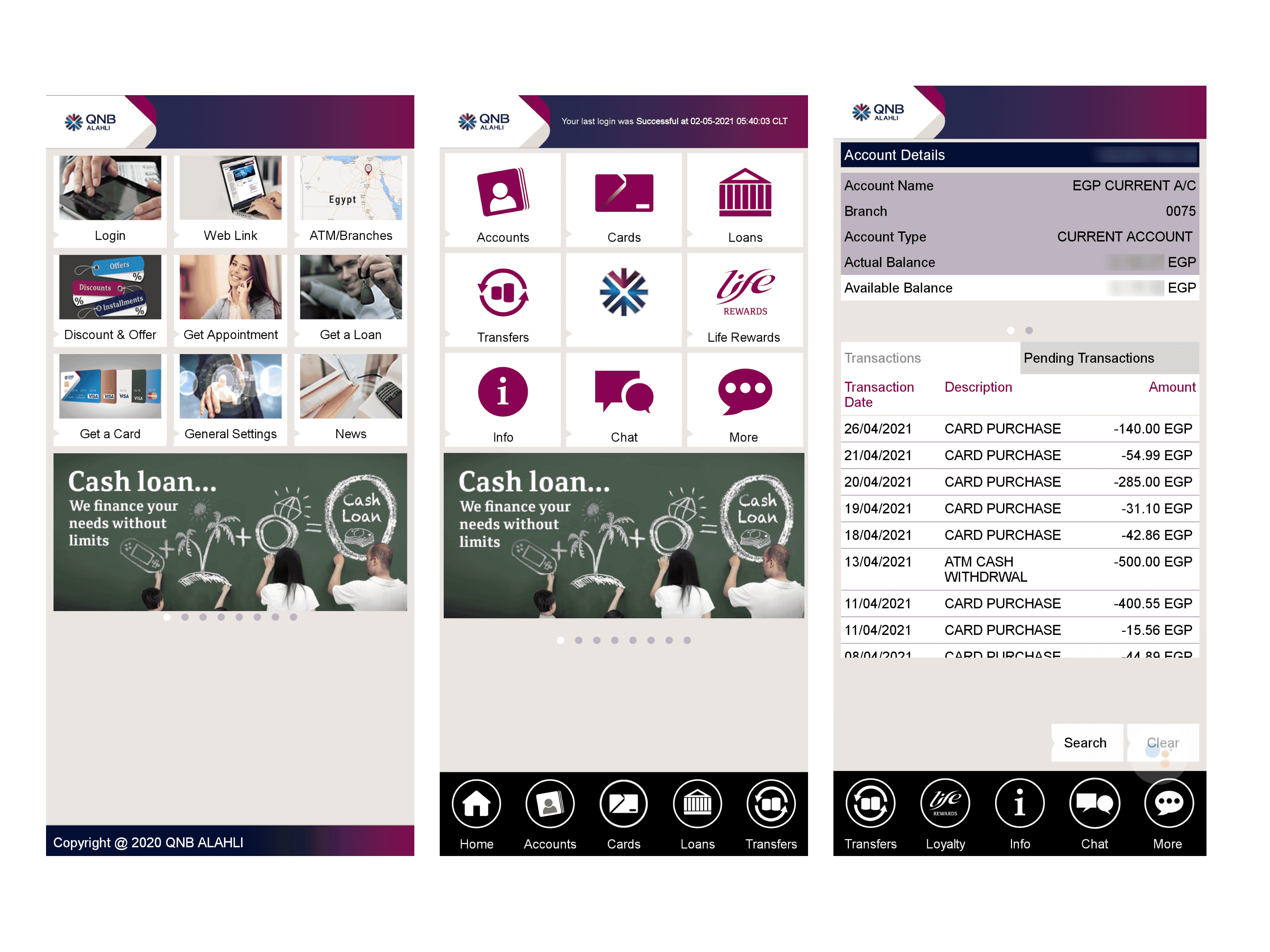
"The back button doesn't work!" said one of the participants. In addition to that, the app also has a lot of navigation and discoverability issues. For example, the navbar is not visible on all screens, the home page offers little to no help to the users since it is a repetition of the navbar.
The Solution
A timeless and task-oriented interface that lets the users get stuff done quickly, with all the features readily accessible without any unnecessary friction or clicks.
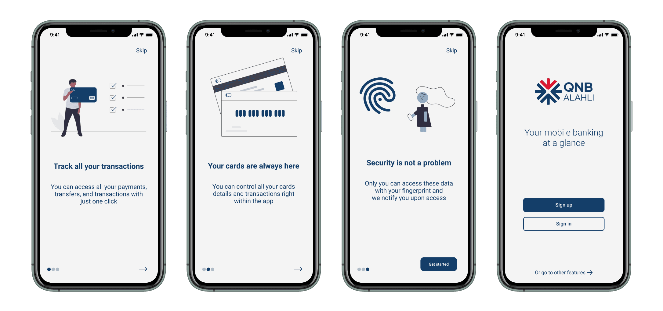
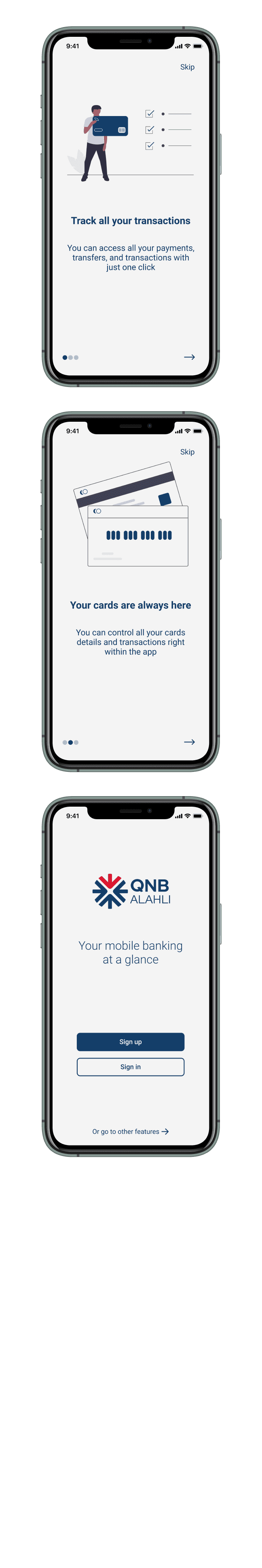
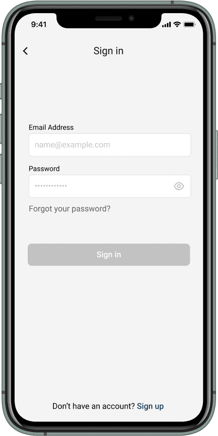
Onboarding
The current app doesn't have an onboarding experience so I made a simple design of what the onboarding could look like.
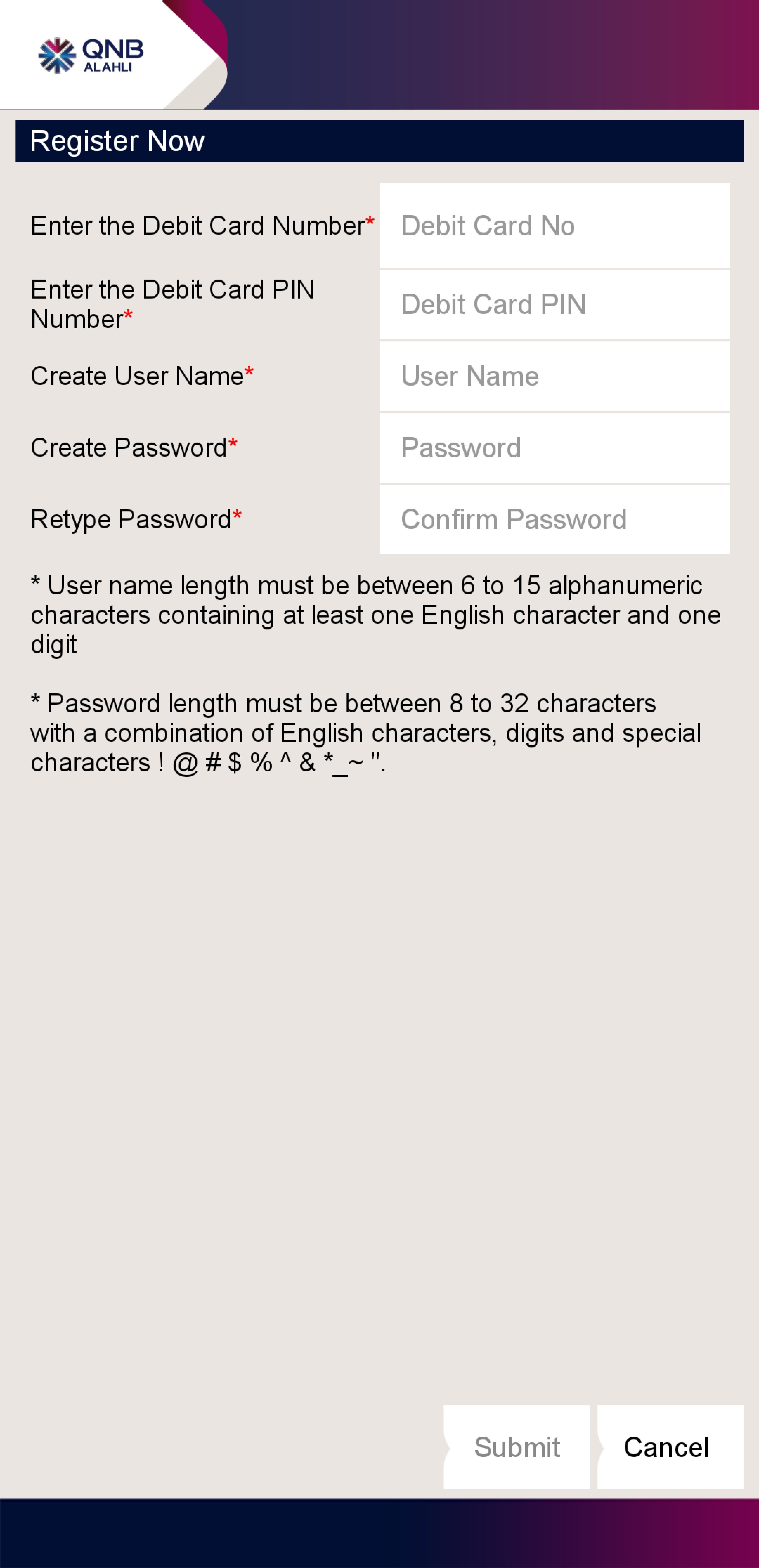
Sign-up
The current sign-up process is not very intuitive and adds cognitive load to the users. I redesigned it into a 2-step process with feedback to the user to make it smoother and easier on the user.
Current sign-up page
Redesigned sign-up page

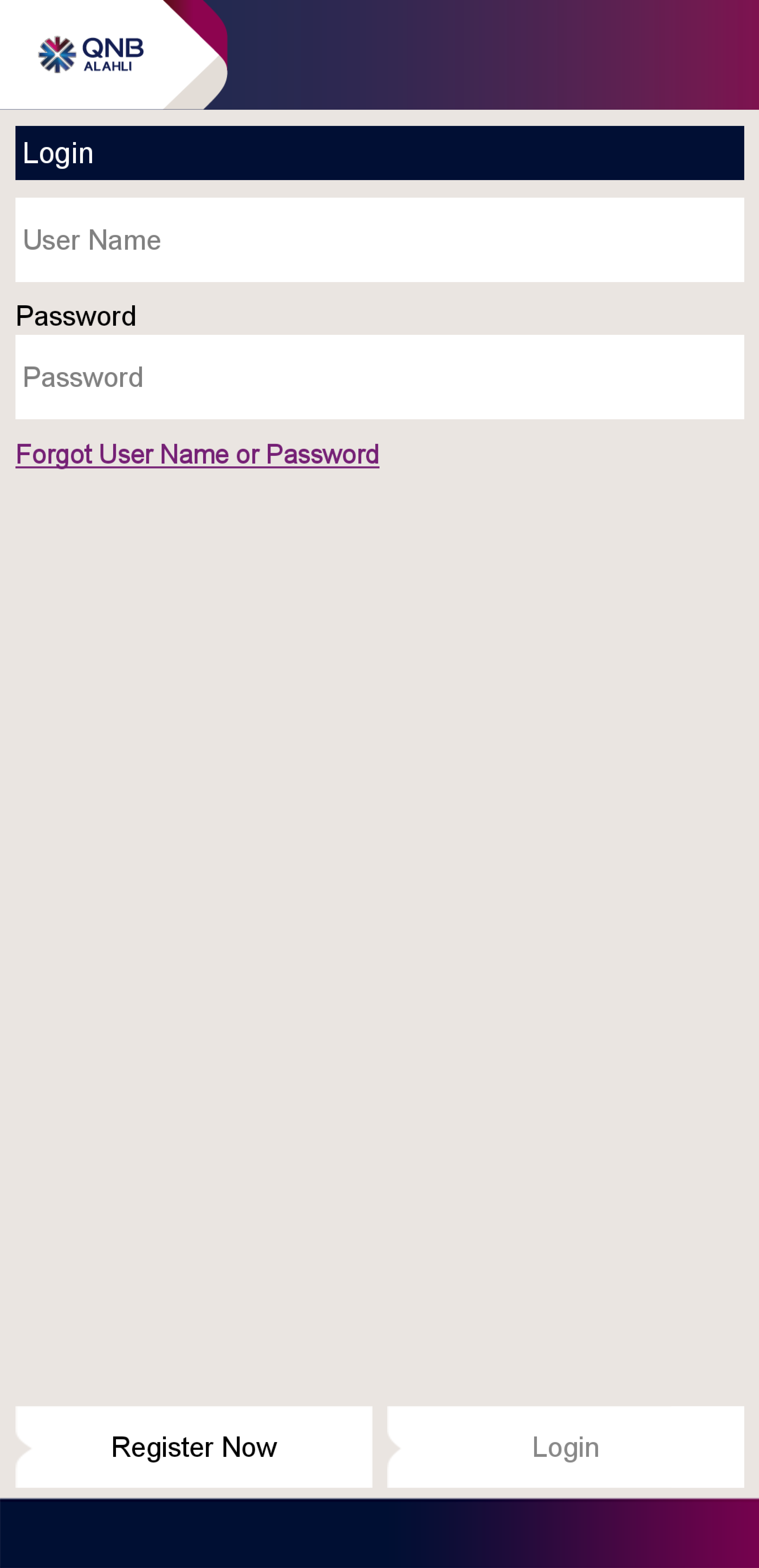
Sign-in
I streamlined the current design, making it more clear and user-friendly. However, the main issue is making users enter their credentials every time they use the app, so this could be improved in development by allowing users to enable fingerprint/Face ID to sign in instead.
Current sign-in page
Redesigned sign-in page
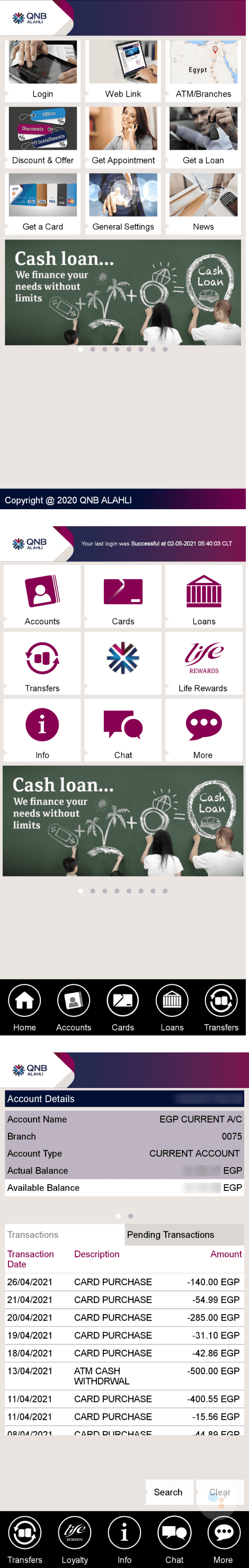
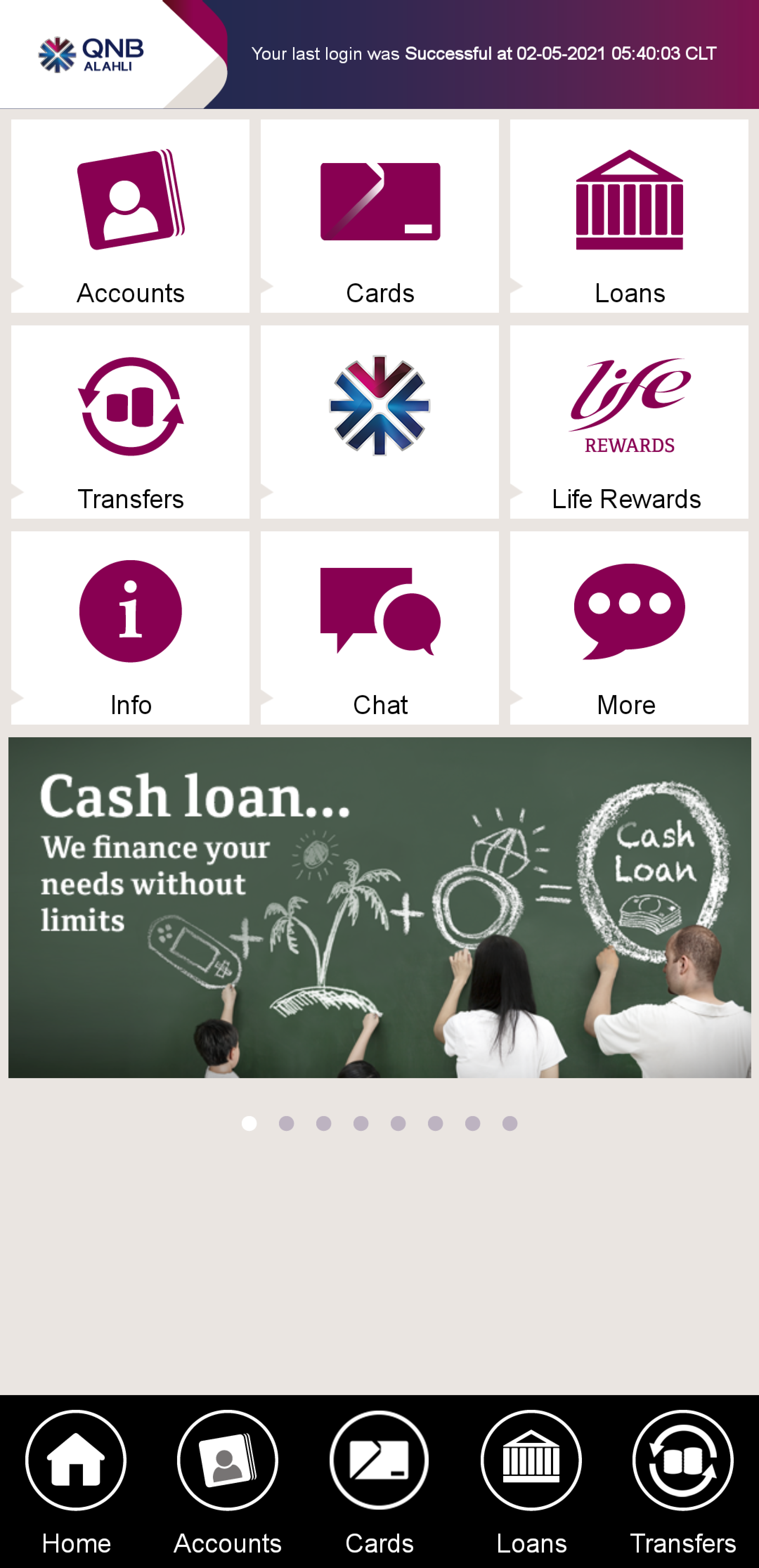
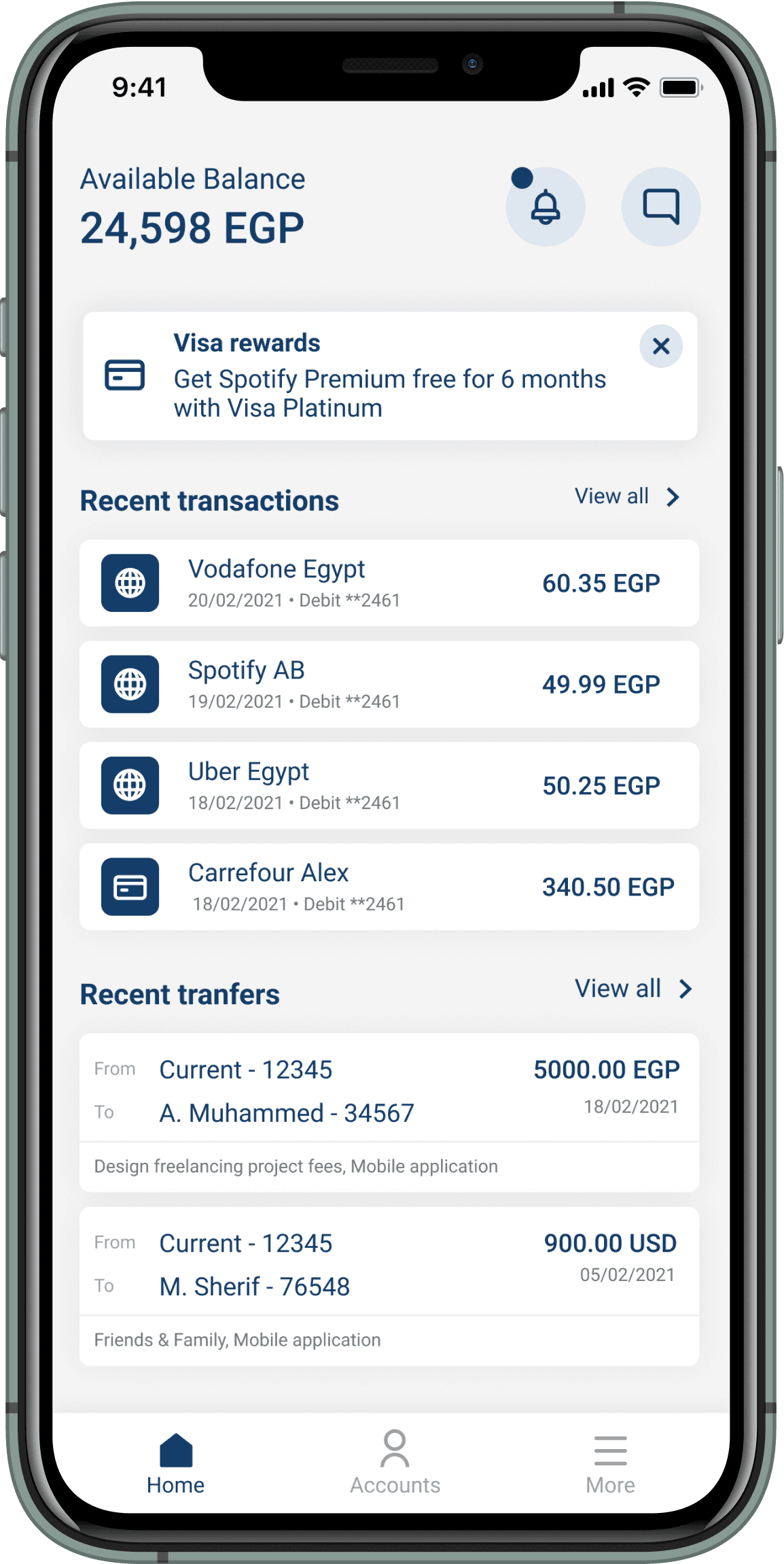
Home page
I redesigned the home page into a dashboard-like layout that provides a summary of the account balance, and recent transactions/transfers, and turned the current news slider into a a pop-up to make it more intuitive.
Current home page
Redesigned home page
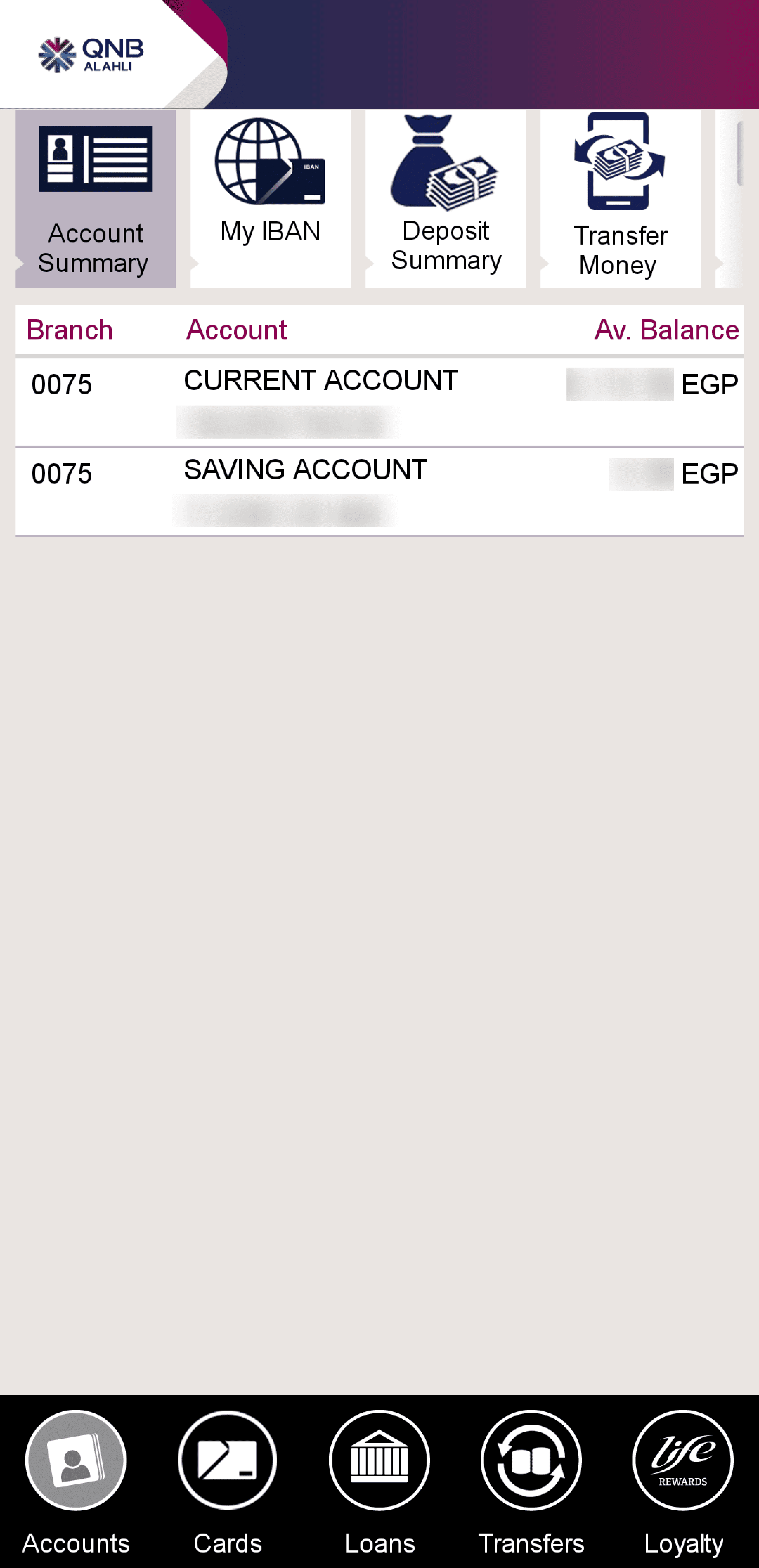
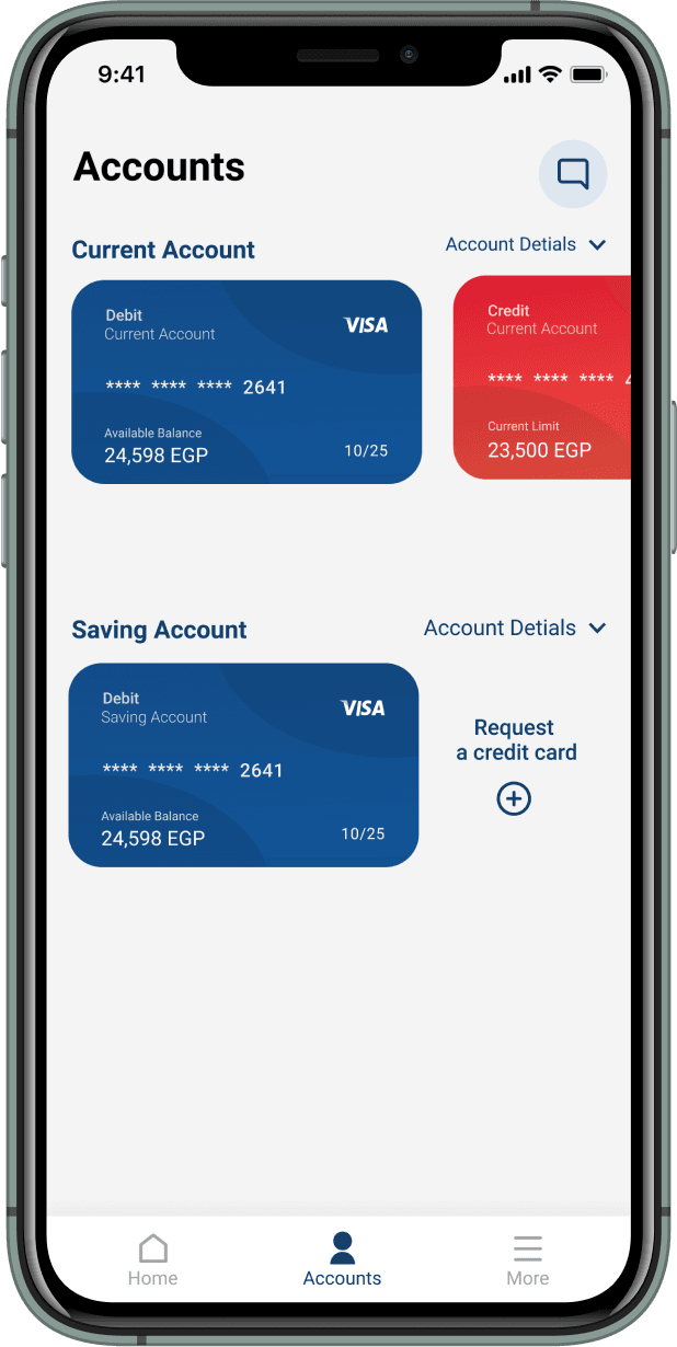
Accounts page
The current accounts page does offer the information needed, but it takes the user another 3 clicks to view the cards inside these accounts since they are in a different menu. I redesigned it so the user has a preview of the cards of each account and then they can click the card to view its transactions and details.
Current accounts page
Redesigned accounts page
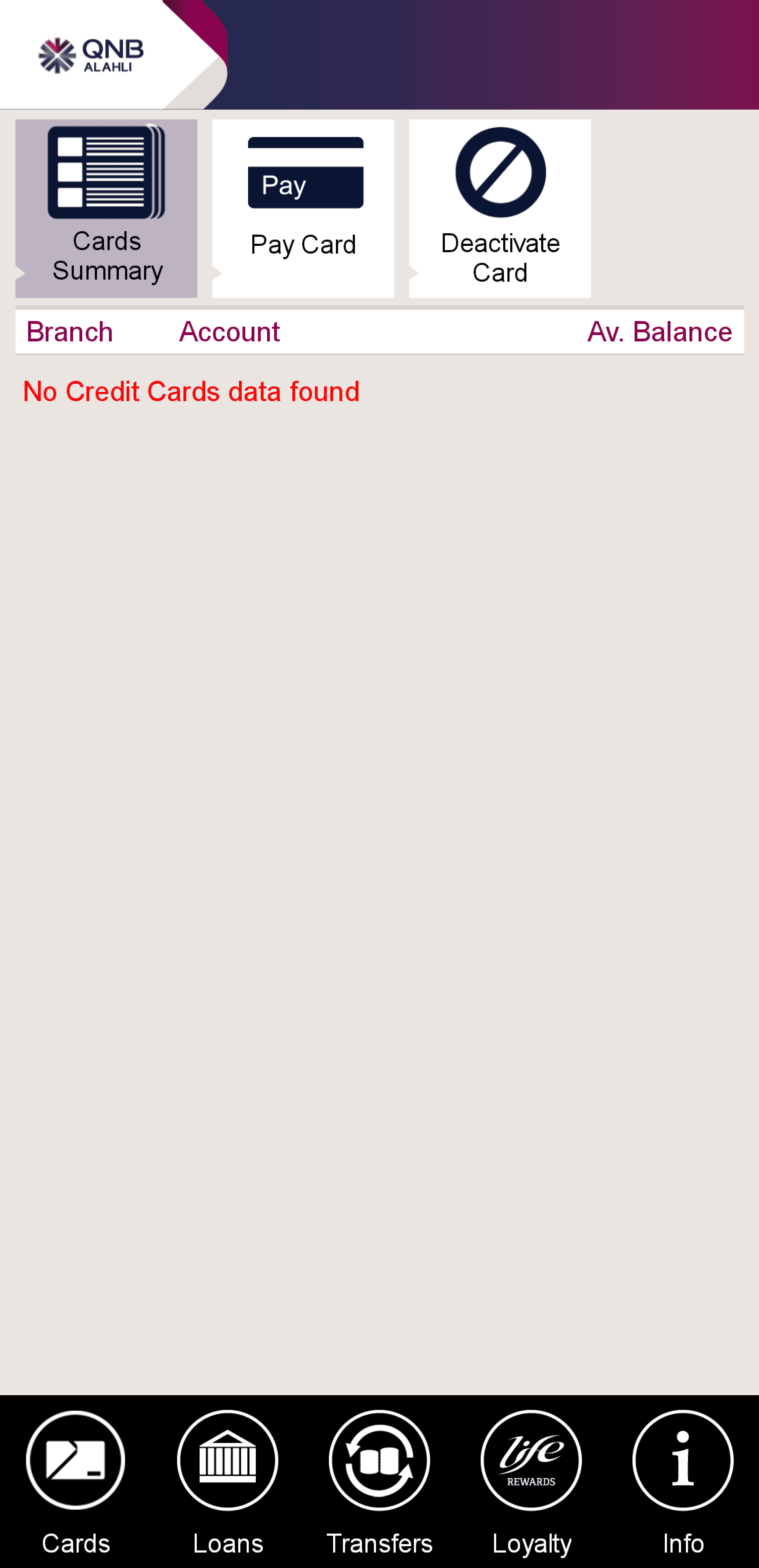
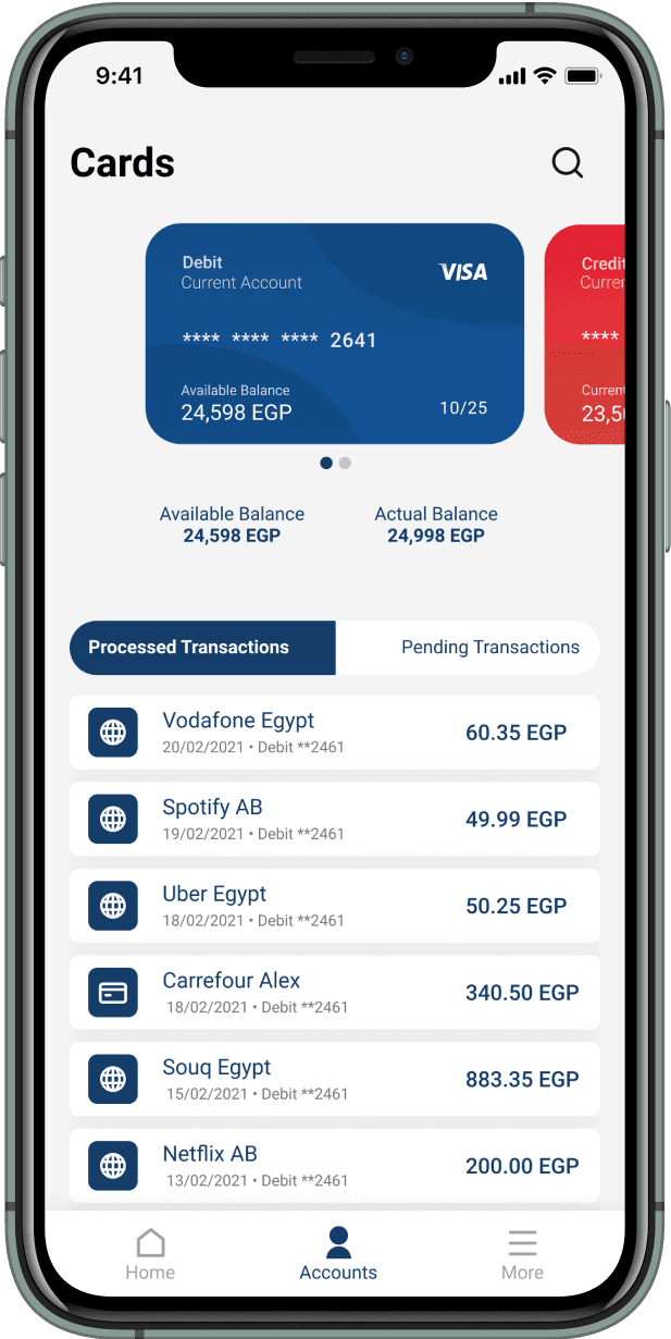
Cards page
I redesigned the cards page so that it shows the transactions associated with each card instead of showing it on the accounts page to have a structure that makes sense to the user (Accounts > Cards of each account > Transactions of each card).
Current cards page
Redesigned cards page
The Testing
I had a testing session with each research participant to assess whether the solutions I designed addressed their pain points and improved the experience. The same tasks were performed to measure the results.